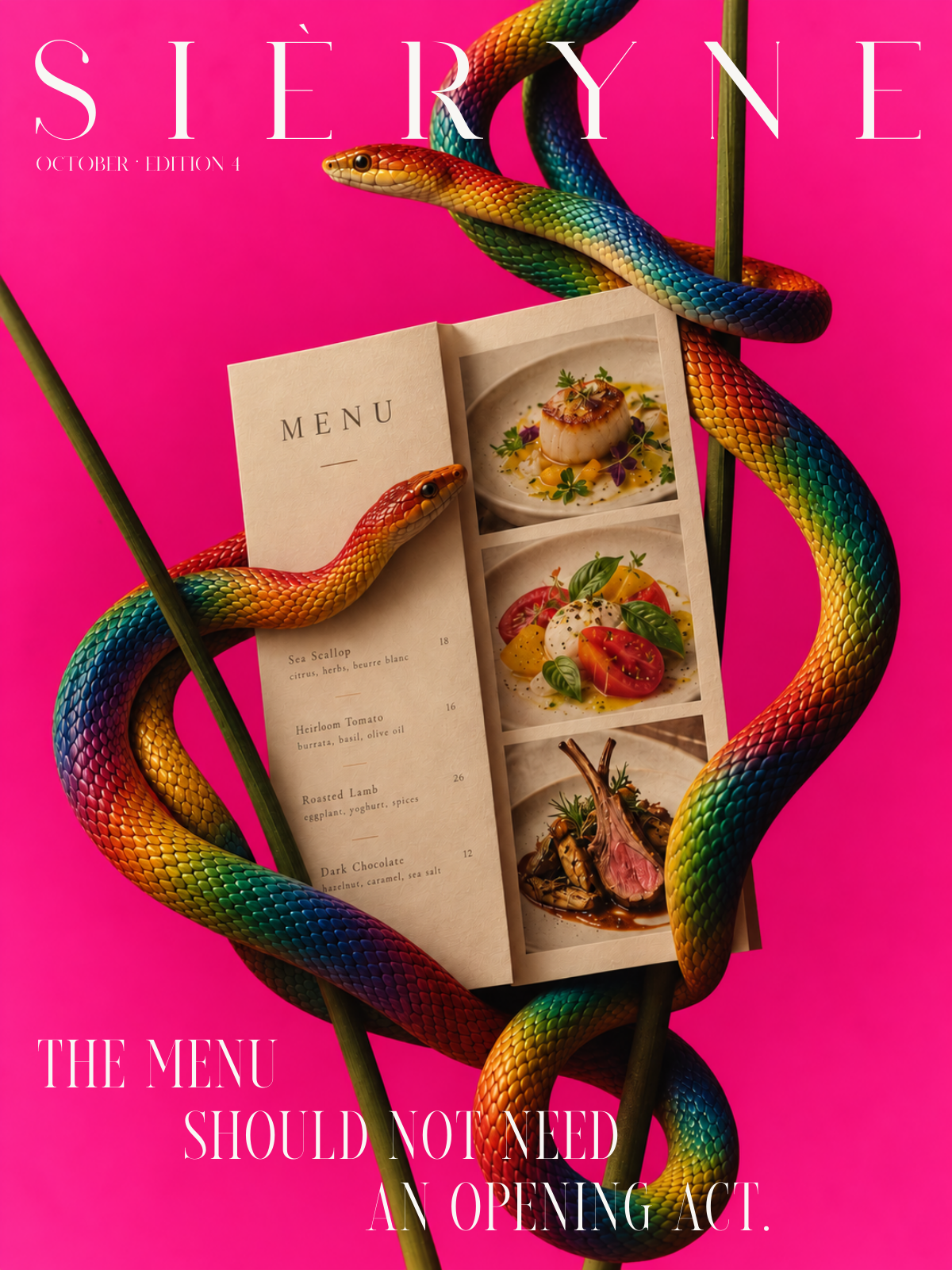
The menu should not need an opening act.
Give the animation a job, then make sure it lets people finish theirs.
A cinematic entrance can make a website memorable. Having to sit through it again to find an email address is memorable for different reasons.
Movement changes when information becomes available. That makes it part of the website's structure, with consequences for the person using it. A transition might explain that a panel has opened. A reveal might guide attention to a detail in the work. An animation that does neither is asking for time without offering much in return.

Try the page without it
Remove the motion temporarily and use the page. Notice whether anything becomes harder to understand. If the sequence explains the relationship between two views, keep that purpose and refine the timing. If nothing is lost, decide whether the flourish earns the interruption.
A first visit and a return visit also deserve different treatment. Someone arriving for the atmosphere may enjoy an introduction. Someone returning for one project should be able to reach it directly. Navigation needs to remain available when the visitor is ready to move on.

Check the actual phone layout
Desktop choreography rarely survives a smaller screen untouched. Text wraps onto more lines. A caption moves beneath an image. A crop that showed the whole subject now removes the detail the sequence was supposed to reveal.
Review the final words and images on the phone layout before setting the pace. Leave enough time to read, keep controls within reach and allow scrolling to remain predictable. A visitor should not have to learn special wrist technique to see the next photograph.

Make two visits
On the first, follow the presentation as intended. On the second, go straight to a particular project, then find the contact details. Record every place the website delays or redirects that task.
Keep the movement that improves understanding. Shorten or remove the rest. The work should still make sense when it stops moving.