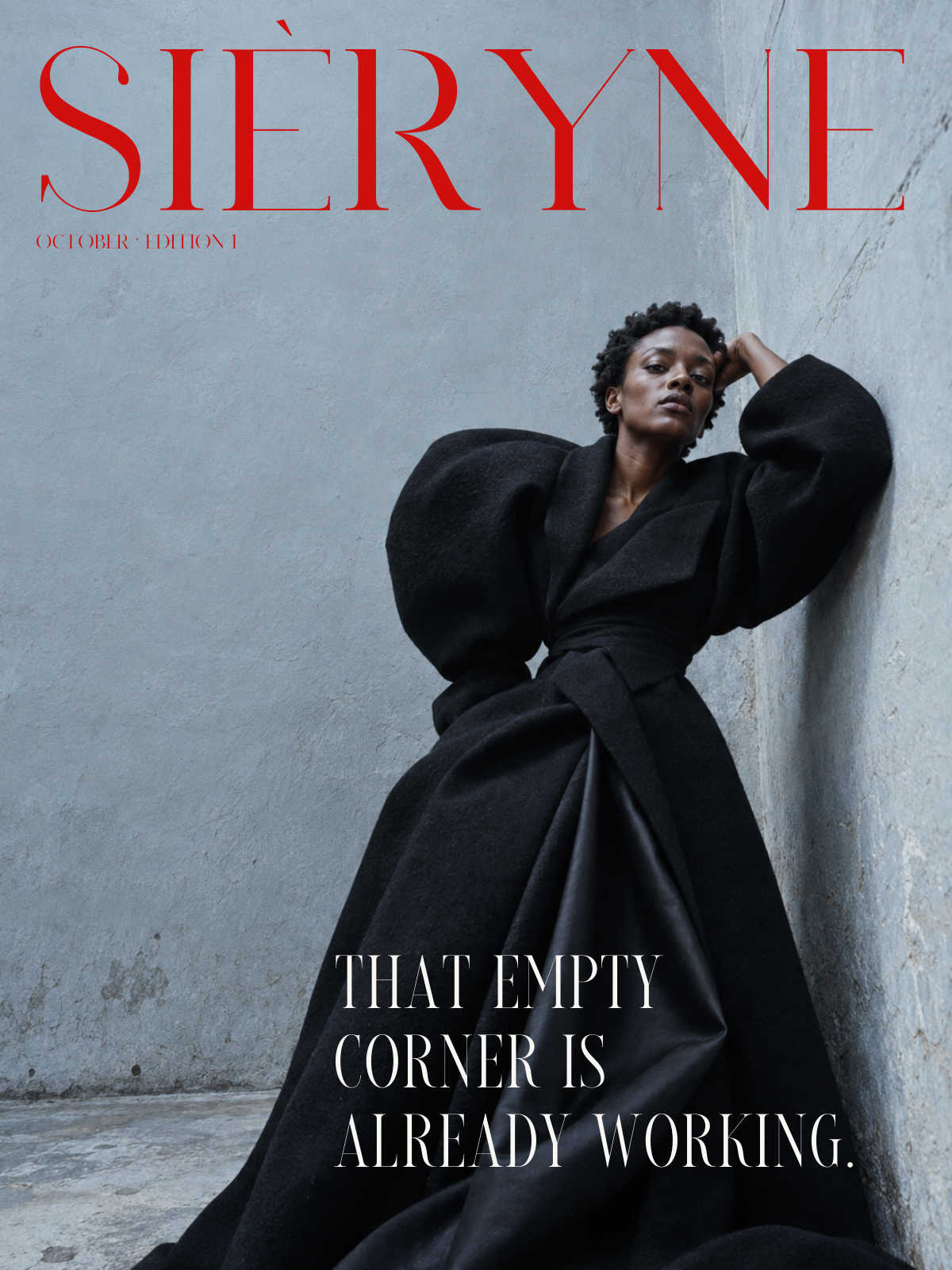
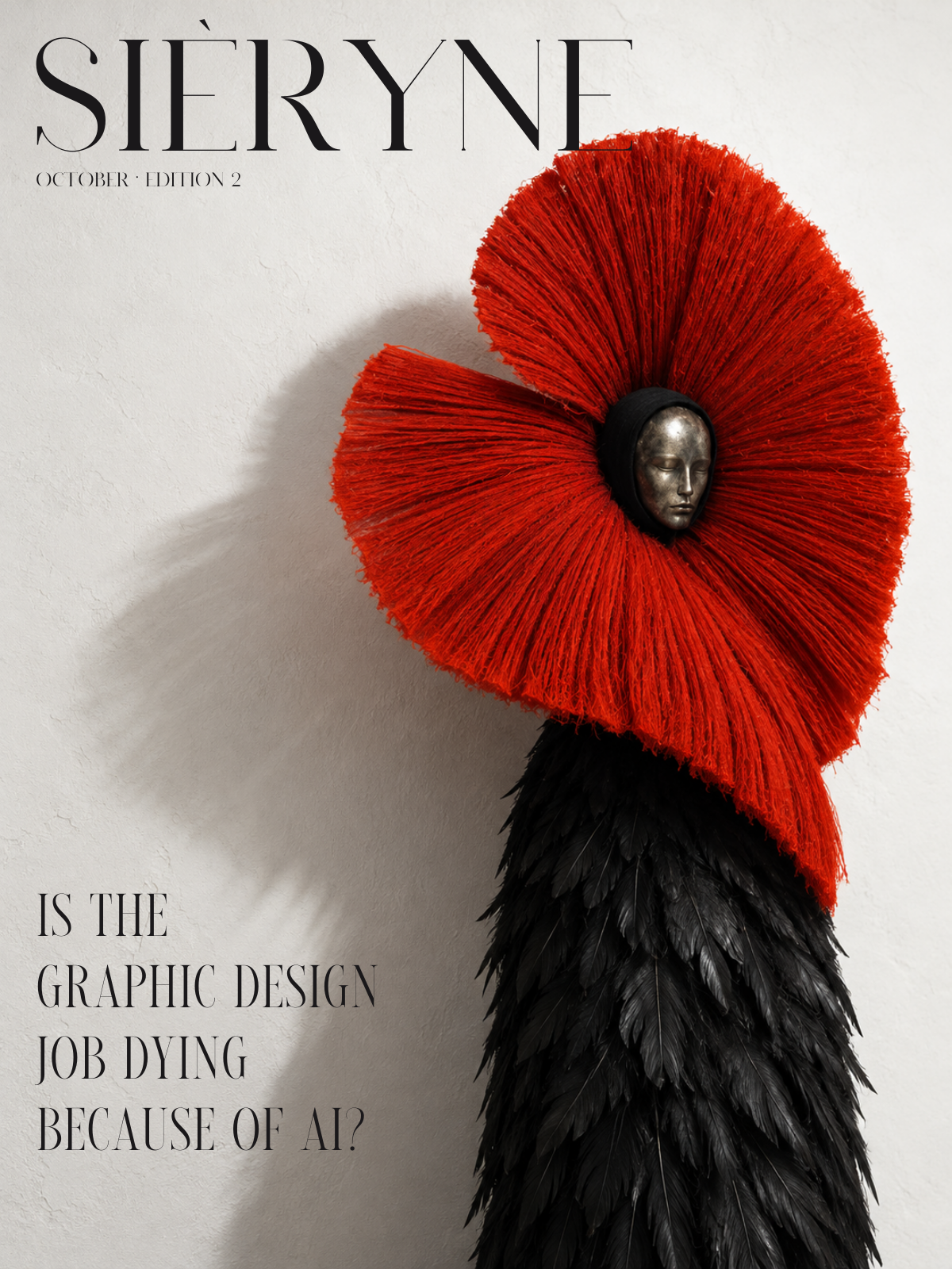
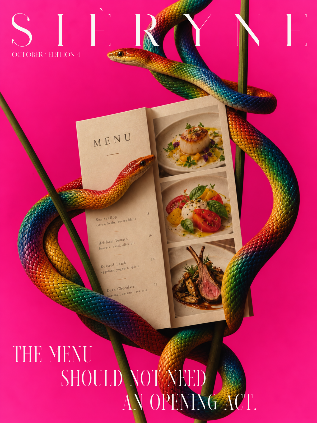
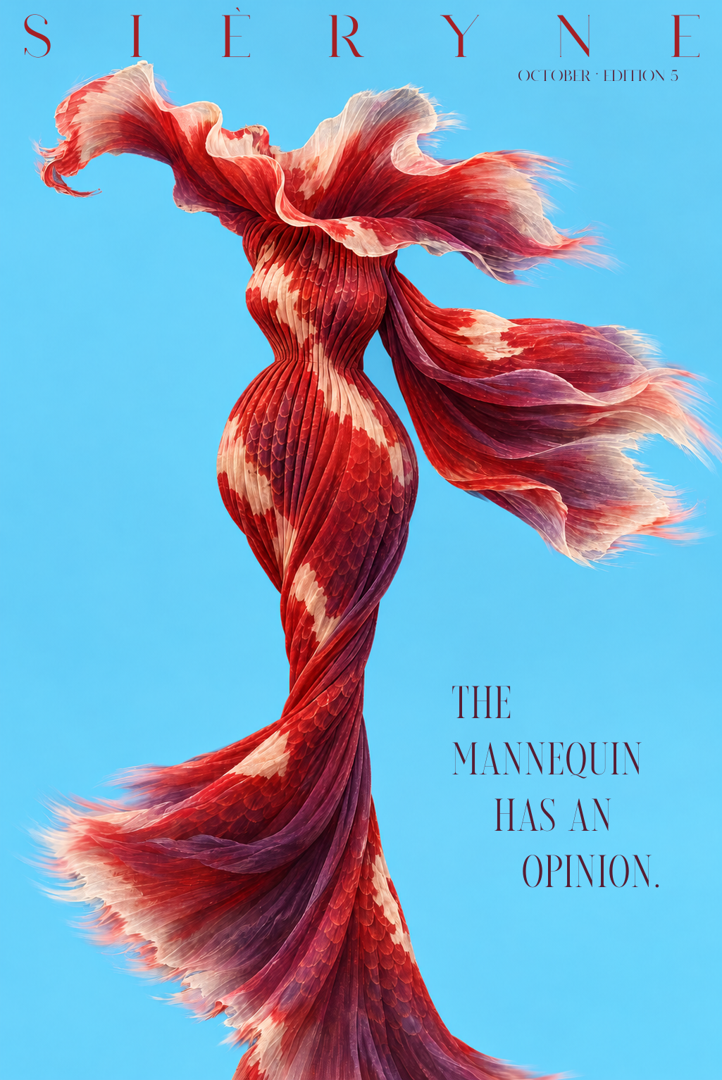
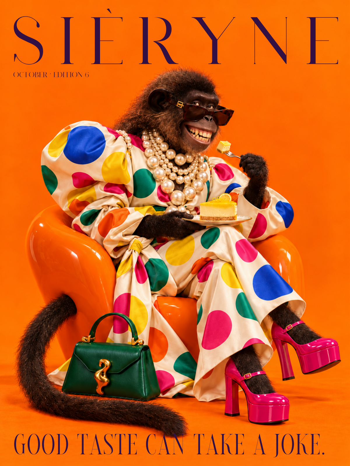
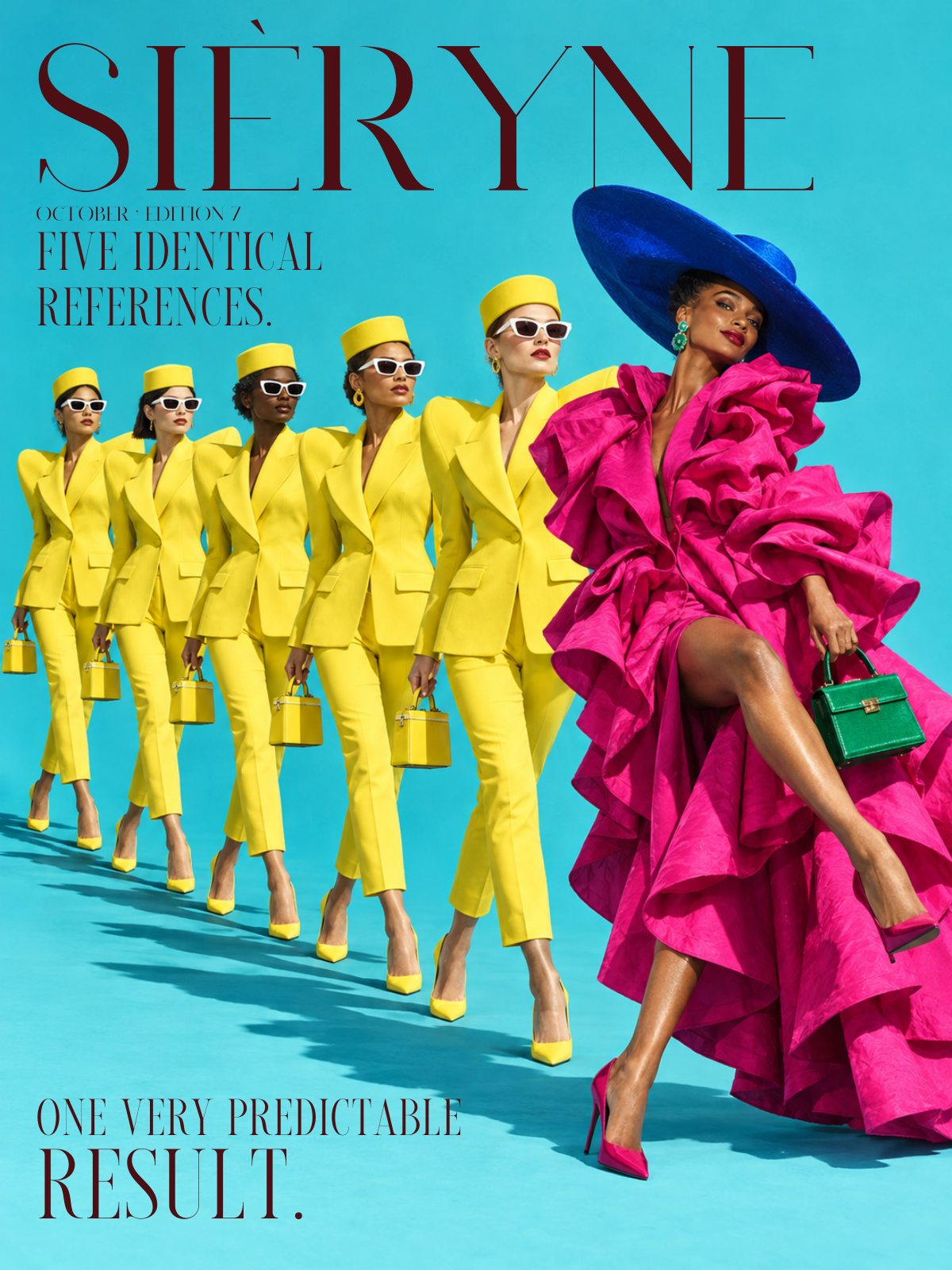
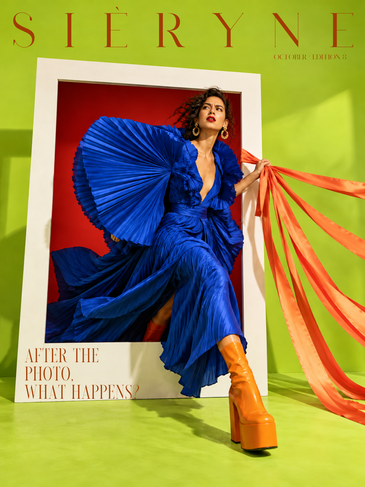
Your logo cannot do everyone's job.

A useful identity holds together in the places the presentation conveniently leaves out.
A beautiful logo can introduce a business. It cannot explain a confused offer, rescue a badly written email or persuade an unrelated set of photographs to become a campaign. That is rather a lot to ask of six letters and a flourish.
The rest of the identity needs decisions of its own. What should people recognise in the images? How does the business speak when something goes wrong? Which information gets attention first? A logo sitting at the top of every page will not settle those questions.
Start with the business
Before choosing a typeface, write down who the business is for, what it offers and why someone should choose it. Use words a customer would understand. If the answer could sit comfortably on a competitor's website, it needs more work.
Those answers give design something to express. A business selling speed needs a different emphasis from one selling a highly involved service. The difference should be visible in what gets explained, how the pages are organised and the images selected.
“Clean and contemporary” leaves most of that undecided. It describes a very well-populated neighbourhood.

Give it an ordinary Tuesday
Test the identity on an invoice, a phone screen and an email explaining a delay. These are useful places to find the gaps a glossy mock-up can hide.
The formats need different things. An invoice should make the amount and payment details easy to find. A campaign image can take more time setting a mood. Both should feel as though they came from the same business, without having to wear an identical layout.

Cover the name
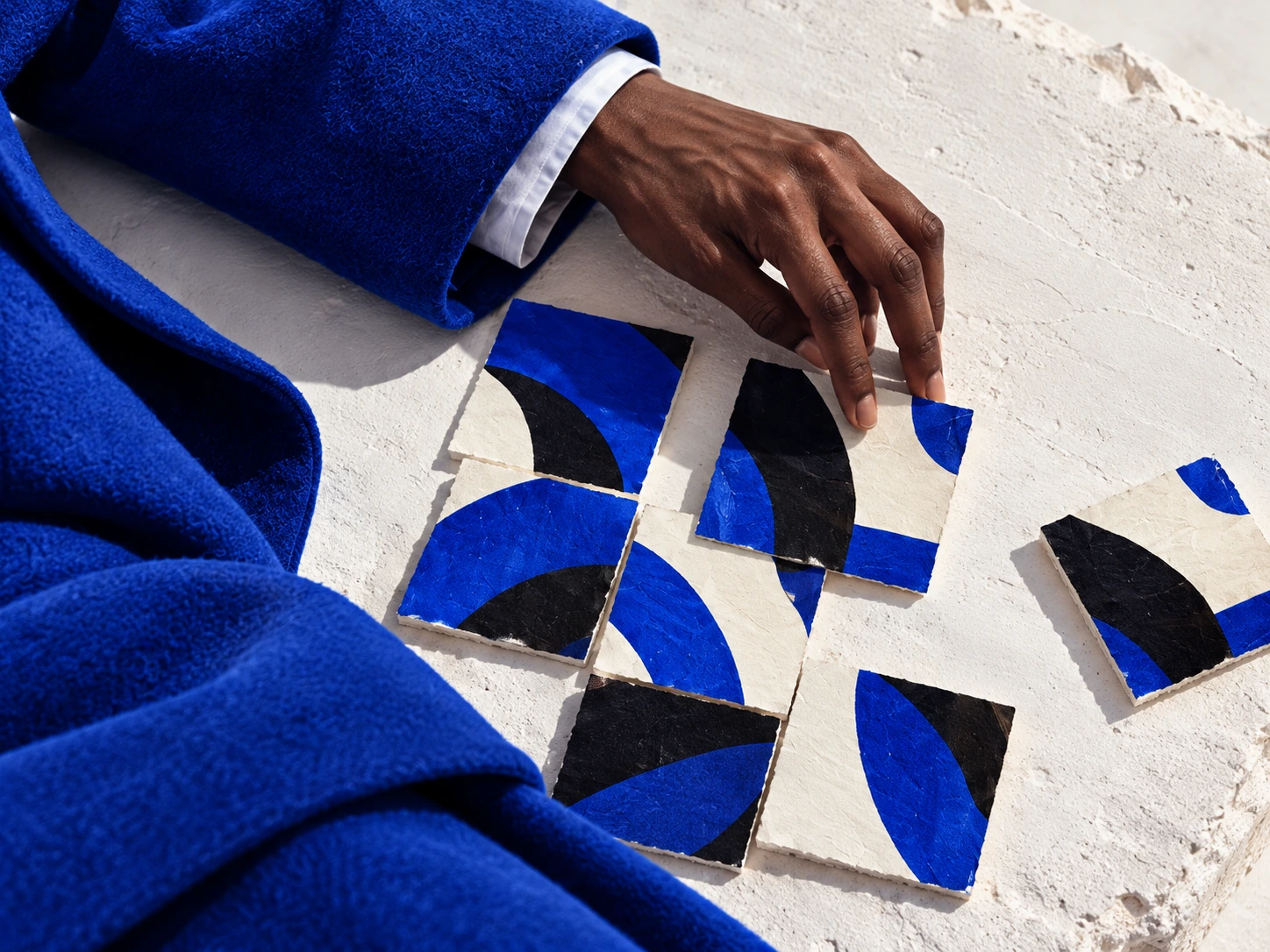
Put several pieces together and hide the logo. Look for recurring choices in the photography, typography and language. If only the colour connects them, there are still decisions to make.
Write those decisions down in a form another person can use. Then ask that person to make something new. If the result belongs to the same brand without copying an existing page, the identity is ready for more than its presentation.